> ## Documentation Index
> Fetch the complete documentation index at: https://koreai-content-gov.mintlify.site/llms.txt
> Use this file to discover all available pages before exploring further.
# Quality insights
This document covers agent evaluation in Analytics and Insights.
* **Quality Monitor** reports quality by evaluation dimension across the project.
* **Agent Performance** reports the same measures agent by agent.
The two pages answer different questions. Quality Monitor tells you which aspect of quality slipped. Agent Performance tells you which agent caused it.
Both pages populate only after evaluation pipelines process conversations. A measure with no evaluations shows a dash rather than a zero.
## Quality monitor
**Quality Monitor** aggregates the output of the evaluation pipelines into one view, scored by dimension. Use it to decide where quality work is worth doing, rather than to judge how a single conversation went.
**Navigation**: **Project** -> **Insights** -> **Quality Monitor**
### Page filters
Environment, channel, and date range controls at the top of the page scope everything below them.
Filter by environment before you read the scores. Evaluations of test traffic and evaluations of production traffic answer different questions, and an average of both tells you neither.
 ### Quality health
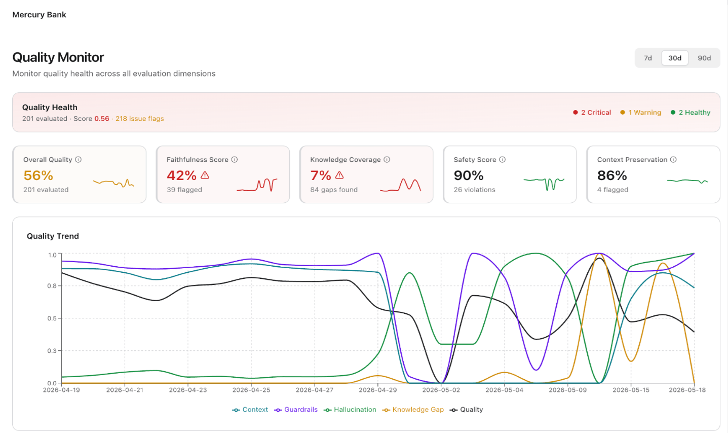
A banner across the top gives three figures: the number of conversations the pipelines evaluated, a weighted overall score that combines the dimensions, and a count of dimensions in each status.
The three statuses are **Critical** (red), **Warning** (amber), and **Healthy** (green).
Read the status counts first. They tell you how many dimensions need attention without your having to interpret each card. A dimension with no data also counts toward the total, so a warning count can reflect missing coverage as readily as poor performance.
### Dimension cards
Each card reports one evaluation dimension for the period. Higher values are better on every dimension, so a low score always signals a problem rather than a threshold you need to interpret.
| Dimension | Description |
| ------------------------ | --------------------------------------------------------------------------------------------------------------------------------------------------------------------------------------------------------------------------- |
| **Overall Quality** | Combines the scores of the dimensions that hold data. Track it for direction over time. It runs too coarse to act on directly, which is the job of the remaining cards. |
| **Faithfulness Score** | Measures how well responses stay grounded in the sources the agent has available. A low score means the agent produces claims it can't support, the failure mode that costs the most trust when customers notice it. |
| **Knowledge Coverage** | Measures how often the knowledge base supports the query the agent receives. This dimension scores your content rather than your agent, so a low score tells you to write documentation instead of changing prompts. |
| **Safety Score** | Measures the rate at which responses pass the configured guardrails. It moves only when guardrails exist, so a persistent dash usually means you have no guardrails in place rather than that the platform checked nothing. |
| **Context Preservation** | Measures how well the agent carries context across turns in one conversation. It degrades first as conversations grow longer, and it usually explains complaints about customers repeating information. |
A dash means the pipeline behind that dimension produced no value for the period. It doesn't mean the dimension scored zero.
### Quality trend
The trend chart plots each dimension as its own series over the period.
Use it for correlation. Dimensions rarely move alone, and a fall in one alongside a rise in another usually points to a single underlying change, such as new traffic the knowledge base doesn't yet cover.
### Dimension details
Below the chart, each dimension appears with its score and a **Critical**, **Warning**, or **Healthy** badge.
Expand a dimension to see the component measures that produced its score. The expansion separates a dimension that one weak measure pulls down from a dimension that runs weak throughout, and the distinction matters because the first needs a targeted fix and the second usually doesn't.
Dimensions with no evaluations in the period carry a no-data badge in place of a status, so you can tell an unmeasured dimension from a failing one.
## Agent performance
**Agent Performance** reports the evaluation measures per agent. Open it once Quality Monitor tells you a dimension slipped. It earns its place in multi-agent projects, where one weak agent can pull down a project average that otherwise looks acceptable.
**Navigation**: **Project** -> **Insights** -> **Agent Performance**
### Page filters
Environment, channel, and date range controls scope the page.
Select **Compare previous period** to add a comparison with the period immediately before the one you selected. The comparison turns the scores from absolute values into a direction of travel. Use it before you draw conclusions from a single period, because evaluation scores move considerably on low volume.
### Quality health
A banner across the top gives three figures: the number of conversations the pipelines evaluated, a weighted overall score that combines the dimensions, and a count of dimensions in each status.
The three statuses are **Critical** (red), **Warning** (amber), and **Healthy** (green).
Read the status counts first. They tell you how many dimensions need attention without your having to interpret each card. A dimension with no data also counts toward the total, so a warning count can reflect missing coverage as readily as poor performance.
### Dimension cards
Each card reports one evaluation dimension for the period. Higher values are better on every dimension, so a low score always signals a problem rather than a threshold you need to interpret.
| Dimension | Description |
| ------------------------ | --------------------------------------------------------------------------------------------------------------------------------------------------------------------------------------------------------------------------- |
| **Overall Quality** | Combines the scores of the dimensions that hold data. Track it for direction over time. It runs too coarse to act on directly, which is the job of the remaining cards. |
| **Faithfulness Score** | Measures how well responses stay grounded in the sources the agent has available. A low score means the agent produces claims it can't support, the failure mode that costs the most trust when customers notice it. |
| **Knowledge Coverage** | Measures how often the knowledge base supports the query the agent receives. This dimension scores your content rather than your agent, so a low score tells you to write documentation instead of changing prompts. |
| **Safety Score** | Measures the rate at which responses pass the configured guardrails. It moves only when guardrails exist, so a persistent dash usually means you have no guardrails in place rather than that the platform checked nothing. |
| **Context Preservation** | Measures how well the agent carries context across turns in one conversation. It degrades first as conversations grow longer, and it usually explains complaints about customers repeating information. |
A dash means the pipeline behind that dimension produced no value for the period. It doesn't mean the dimension scored zero.
### Quality trend
The trend chart plots each dimension as its own series over the period.
Use it for correlation. Dimensions rarely move alone, and a fall in one alongside a rise in another usually points to a single underlying change, such as new traffic the knowledge base doesn't yet cover.
### Dimension details
Below the chart, each dimension appears with its score and a **Critical**, **Warning**, or **Healthy** badge.
Expand a dimension to see the component measures that produced its score. The expansion separates a dimension that one weak measure pulls down from a dimension that runs weak throughout, and the distinction matters because the first needs a targeted fix and the second usually doesn't.
Dimensions with no evaluations in the period carry a no-data badge in place of a status, so you can tell an unmeasured dimension from a failing one.
## Agent performance
**Agent Performance** reports the evaluation measures per agent. Open it once Quality Monitor tells you a dimension slipped. It earns its place in multi-agent projects, where one weak agent can pull down a project average that otherwise looks acceptable.
**Navigation**: **Project** -> **Insights** -> **Agent Performance**
### Page filters
Environment, channel, and date range controls scope the page.
Select **Compare previous period** to add a comparison with the period immediately before the one you selected. The comparison turns the scores from absolute values into a direction of travel. Use it before you draw conclusions from a single period, because evaluation scores move considerably on low volume.
 ### Agent health
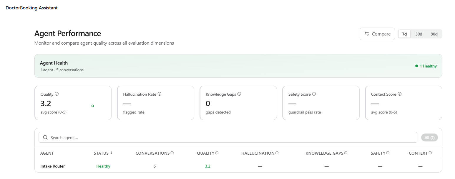
A banner reports how many agents the pipelines evaluated, how many conversations that covered, and how many agents fall into each status: **Critical** (red) and **Healthy** (green).
It tells you whether you face a broad problem or a single agent, before you read any individual score.
### Metric cards
Five cards aggregate the measures across all agents in scope.
| Metric | Description |
| ---------------------- | ------------------------------------------------------------------------------------------------------------------------------------------------------------------------------------------------------------------------------------- |
| **Quality** | Averages the quality score across evaluated conversations on a five point scale. The table below reports the same measure per agent, so compare the two to see whether the average describes your agents evenly or conceals a spread. |
| **Hallucination Rate** | Reports the rate at which the pipeline flags responses for unsupported claims. Lower is better here, unlike the other cards, so read this card separately rather than scanning the row for low numbers. |
| **Knowledge Gaps** | Counts the conversations where the knowledge base couldn't support the query. It reports a count rather than a rate, so weigh it alongside conversation volume before you treat a rise as a regression. |
| **Safety Score** | Reports the rate at which responses pass the configured guardrails. |
| **Context Score** | Averages how well agents carry context across turns, on a five point scale. |
### Agent table
The table repeats these measures for each agent, alongside the agent's conversation count and an overall status that derives from its scores. The status appears as a **Critical** (red) or **Healthy** (green) badge.
Read the table with the conversation count in view. An agent that the pipeline evaluated on a handful of conversations can show the worst scores on the page without being the problem worth fixing.
To work through the table:
* Search by name to find a specific agent.
* Sort on status to bring the agents that need attention to the top.
* Switch between **Critical** and **All** using the filter pills to handle the failing agents first.
### Quality trend
The trend chart plots quality score and flagged conversation count on separate axes.
Read the two series together. Quality that falls while flags stay flat indicates a gradual drift in scoring. Quality that falls as flags rise points to specific conversations going wrong, which you can open and read.
### Agent health
A banner reports how many agents the pipelines evaluated, how many conversations that covered, and how many agents fall into each status: **Critical** (red) and **Healthy** (green).
It tells you whether you face a broad problem or a single agent, before you read any individual score.
### Metric cards
Five cards aggregate the measures across all agents in scope.
| Metric | Description |
| ---------------------- | ------------------------------------------------------------------------------------------------------------------------------------------------------------------------------------------------------------------------------------- |
| **Quality** | Averages the quality score across evaluated conversations on a five point scale. The table below reports the same measure per agent, so compare the two to see whether the average describes your agents evenly or conceals a spread. |
| **Hallucination Rate** | Reports the rate at which the pipeline flags responses for unsupported claims. Lower is better here, unlike the other cards, so read this card separately rather than scanning the row for low numbers. |
| **Knowledge Gaps** | Counts the conversations where the knowledge base couldn't support the query. It reports a count rather than a rate, so weigh it alongside conversation volume before you treat a rise as a regression. |
| **Safety Score** | Reports the rate at which responses pass the configured guardrails. |
| **Context Score** | Averages how well agents carry context across turns, on a five point scale. |
### Agent table
The table repeats these measures for each agent, alongside the agent's conversation count and an overall status that derives from its scores. The status appears as a **Critical** (red) or **Healthy** (green) badge.
Read the table with the conversation count in view. An agent that the pipeline evaluated on a handful of conversations can show the worst scores on the page without being the problem worth fixing.
To work through the table:
* Search by name to find a specific agent.
* Sort on status to bring the agents that need attention to the top.
* Switch between **Critical** and **All** using the filter pills to handle the failing agents first.
### Quality trend
The trend chart plots quality score and flagged conversation count on separate axes.
Read the two series together. Quality that falls while flags stay flat indicates a gradual drift in scoring. Quality that falls as flags rise points to specific conversations going wrong, which you can open and read.